

Nanis – New manifesto for a transformable jewelry identity
Shortly before INHORGENTA, Nanis is starting a new chapter with a comprehensive rebranding.
The Vicenza-based jewelry house is sharpening its identity—with a clear focus on versatility, freedom, and contemporary expressiveness. Jewelry is not understood as a static object, but as a companion in everyday life, a means of personal transformation.
Discover Nanis at INHORGENTA here: Hall B1, Booth 305
Design codes and visual clarity
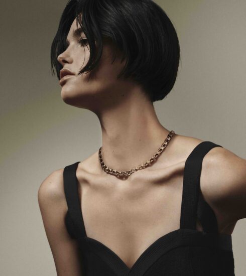
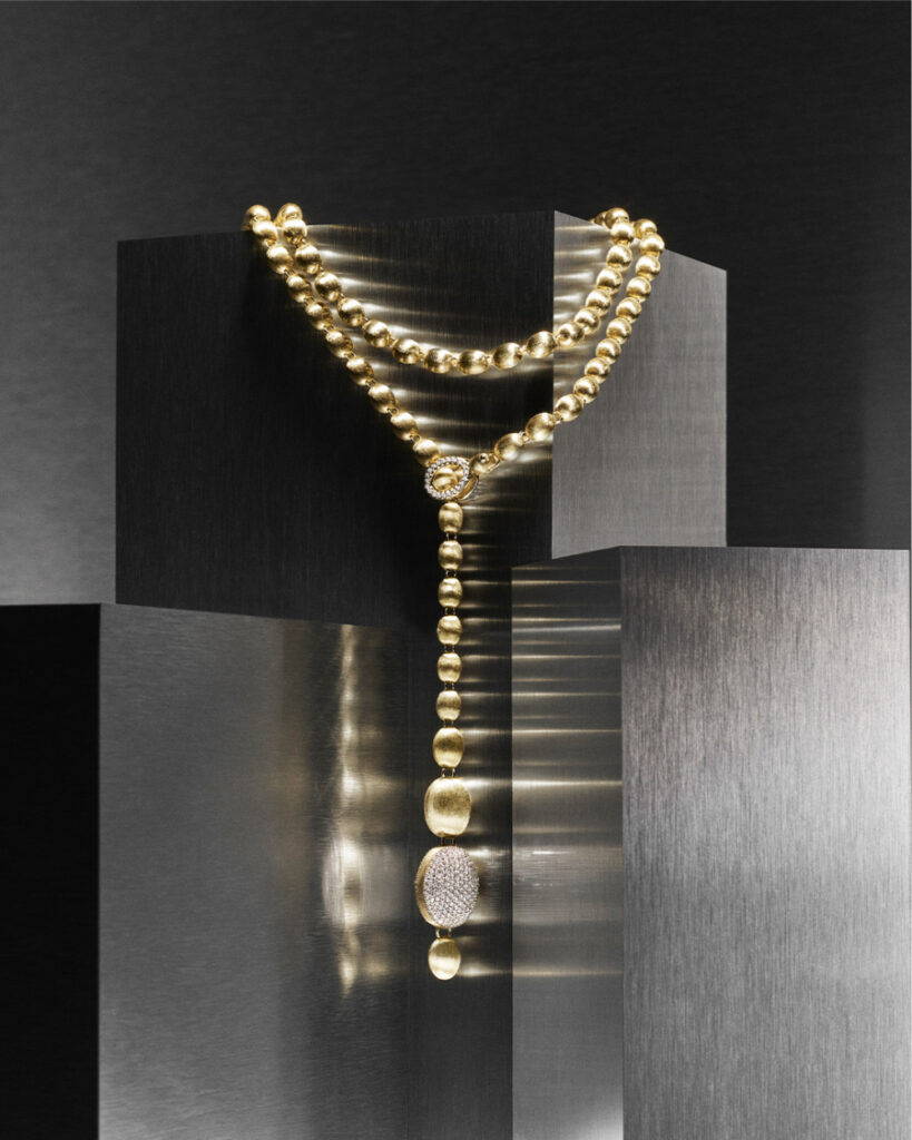
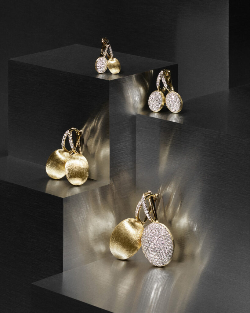
Curved shapes, lightness, material diversity, and versatility characterize the new brand world. The signature style remains distinctive and cosmopolitan—a combination of contemporary glamour, effortless elegance, and subtle irony. Nani also sets new visual accents: a reduced color palette with plum and brown tones, clear typography, and a striking logo restructure the identity.
Boutique experience area
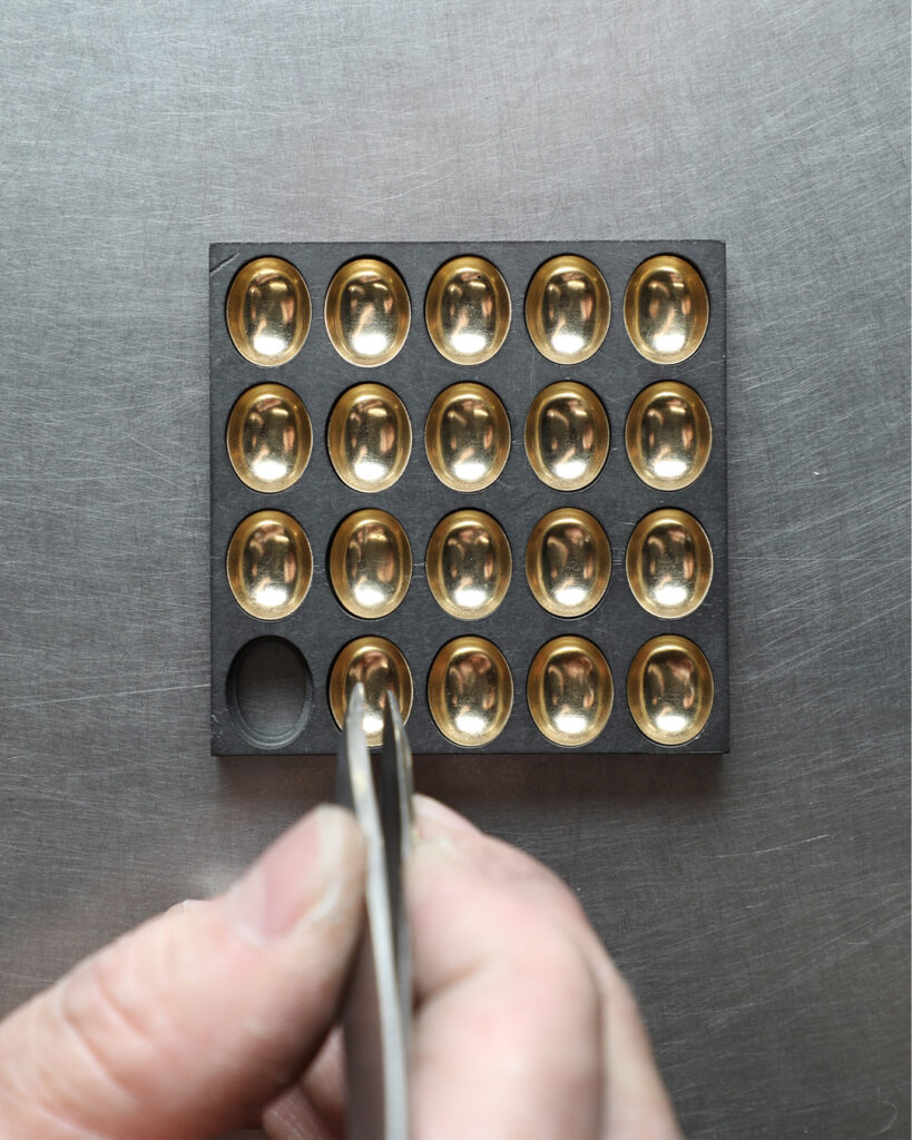
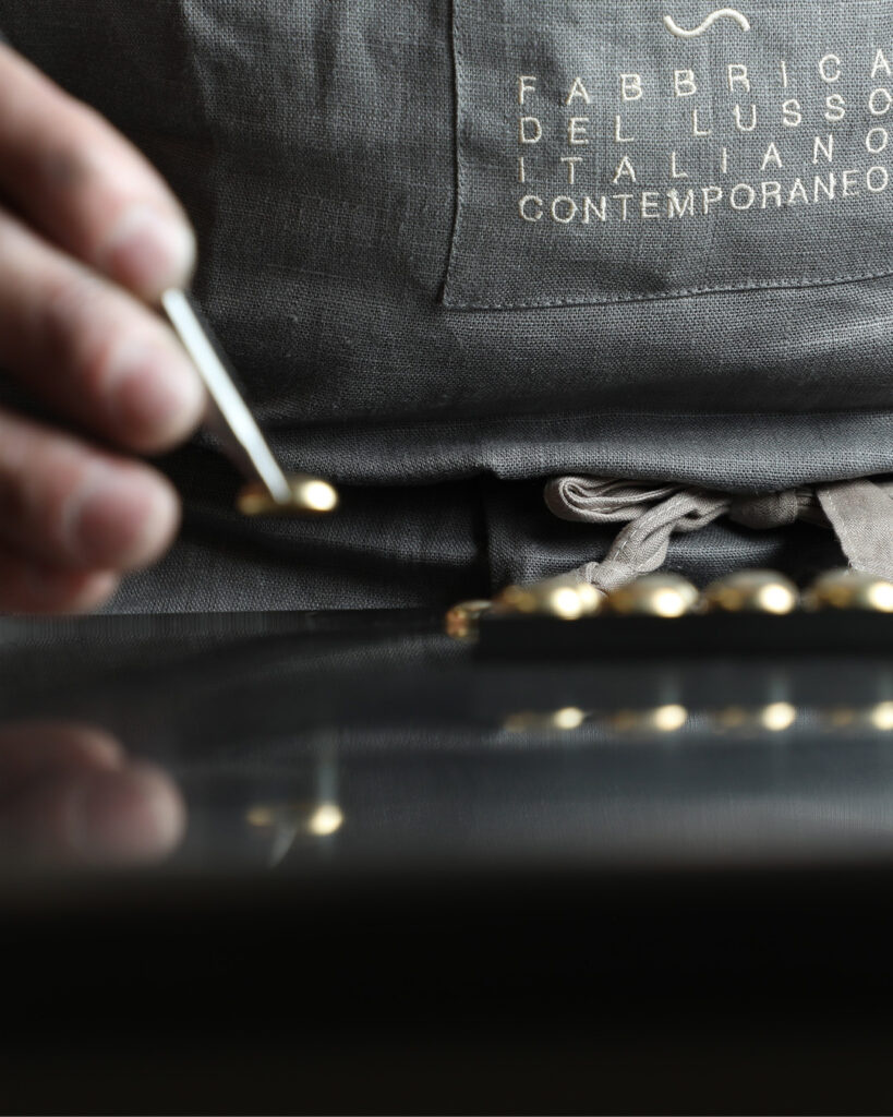
The change is particularly evident in the retail concept. Sales rooms are designed as atmospheric experience spaces in which materials, light, and movement are deliberately staged. Nanis Texture—a finely woven Italian fabric with a subtle gold line—gives the surfaces depth and character.

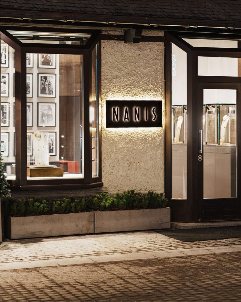
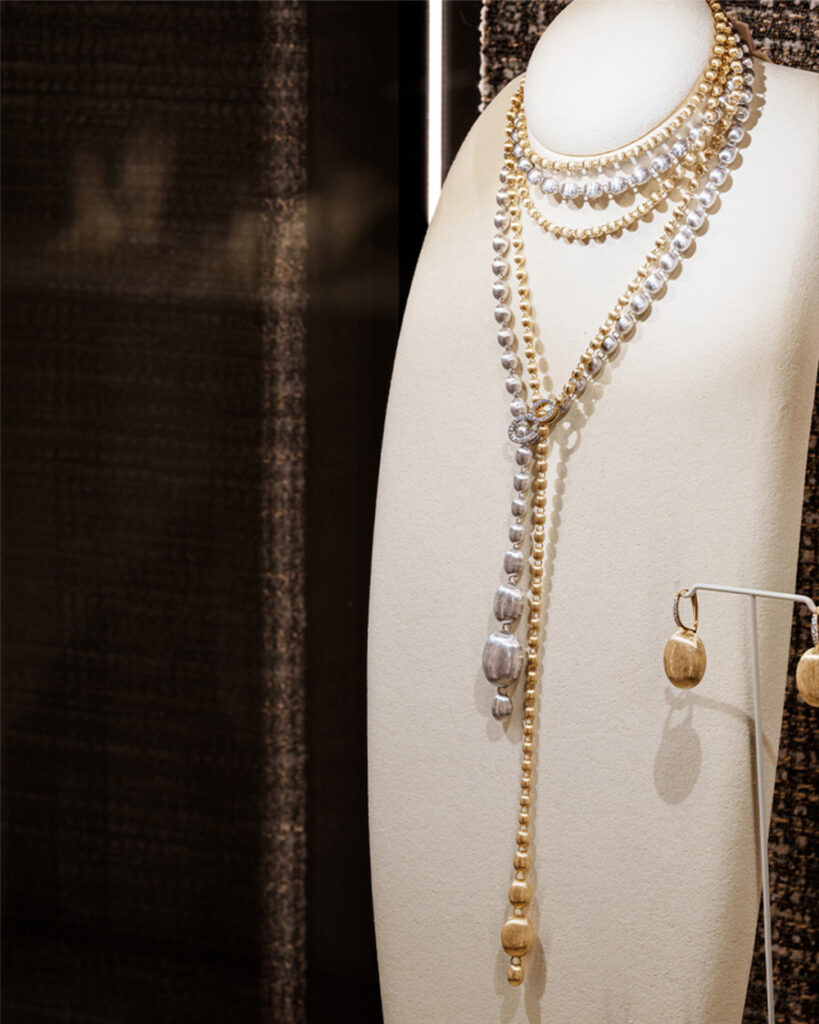
The new boutique concept
Jewelry as a reminder of one’s own identity
Creative director Laura Bicego succinctly sums up the idea behind it:
Jewelry doesn’t define who you are—it reminds you of who you are.
With its new manifesto, Nanis reaffirms its position as an Italian maison where tradition and innovation, elegance and lightness come together.